Page Speed Insights for Mobile launched the other week. It’s a tool that analyses your site in the context of a mobile device and tells you what you need to do to improve the network performance of the site.
In about an hour I had taken 3 seconds off my blogs page load time by removing JS files and adding Caching (doh!) and crunching PNGs (double doh!), going from a score of about 34 to 84.
One of the criteria it suggested “Reduce render blocking scripts in ‘Above the Fold’ content”, specifically fixing the blocking CSS. The theory behind this is that the reader should get the first screens worth of content to the user in the first few TCP packets of response. Any script or CSS file that is required to display content within the first screen of content is an additional network which will significantly slow down the apparent rendering of the page.
In my head this makes sense - Critical CSS is the minimum set of CSS I need to make my page look as I expect and readable to the user. Critical CSS in the context of Page Speed Insights for mobile is the Minumum set of CSS required to render the Above-the-fold content. Ignoring whether AtF is really a thing on the web these days, the concept is that often users load the page at the top of the screen and you want to get that set of data to the user as quickly as possible, especially on Mobile where every connection you make to a server slows your site down.
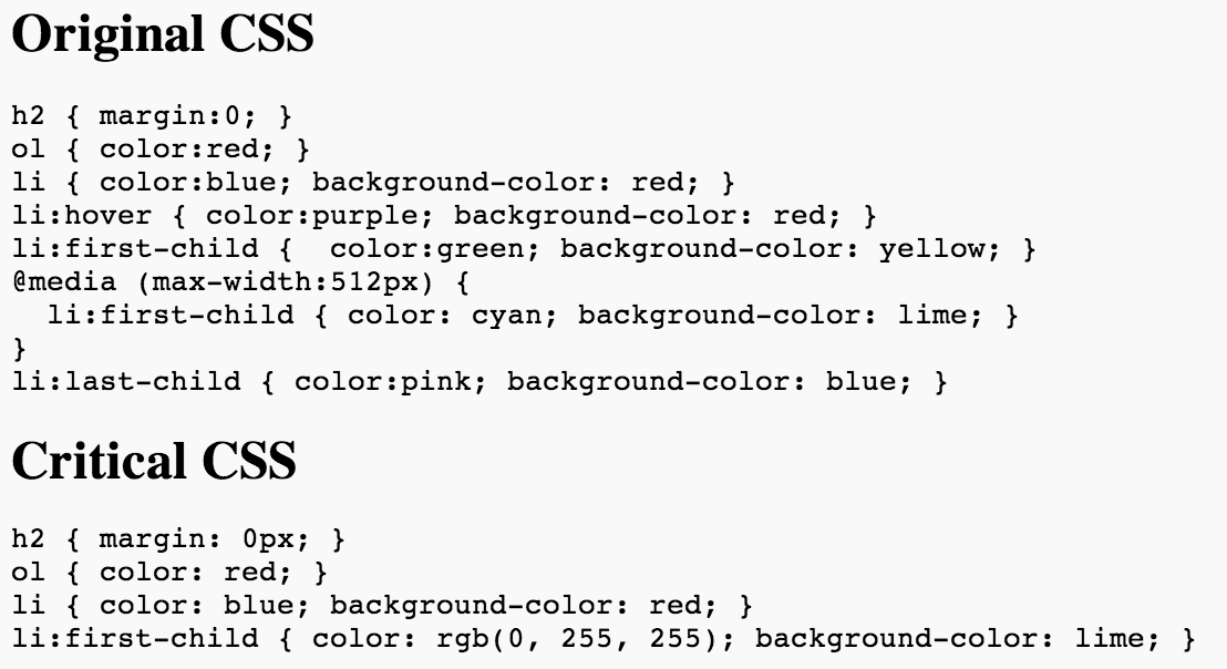
An example follows - the original CSS in this image includes a whole set of features that are not applicable, overriden or are not visible above the fold (if you read a couple of paragraphs down you will see the link to demo). In this code though, the last-child pseudo selector is not output because the content is not visible.

In practice determining what is considered the “Critical CSS” is rather complex. I have one rather huge CSS file that is used for all the content across the site. How do I determine what is critical to that page and what is not?
I have developed a quick proof of concept that will walk your Page’s DOM, and determine the minimal set of CSS. You can fork it on Github or use this code in a bookmarklet or DevTools Snippet. The general flow is:
- Iterate across every element in the DOM
- Accept elements whose “top” is within the height of window.
- Detect the list of styles that currently apply to the element in view using
window.getMatchedCSS(node) - Add them to a bucket.
- Return the list of CSS.
It works pretty well. If the element is not visible or not on the first screen of content then its matching CSS selectors are not returned in the output.
Possible uses:
- Determine the minimum viable set of CSS for a page so you can clean it up.
- Integrate into build and testing steps and warn on excessive CSS used on pages. Possibly using PhantomJS
- Make it a part of your build to construct the CSS files needed for each page and just the CSS needed for that page.
There are some caveats though.
- It only works in WebKit and Blink engines.
- It doesn’t know about Media Queries it only determines content based on the current viewport
- It will not find the CSS selectors for psuedo elements such as :hover etc.
