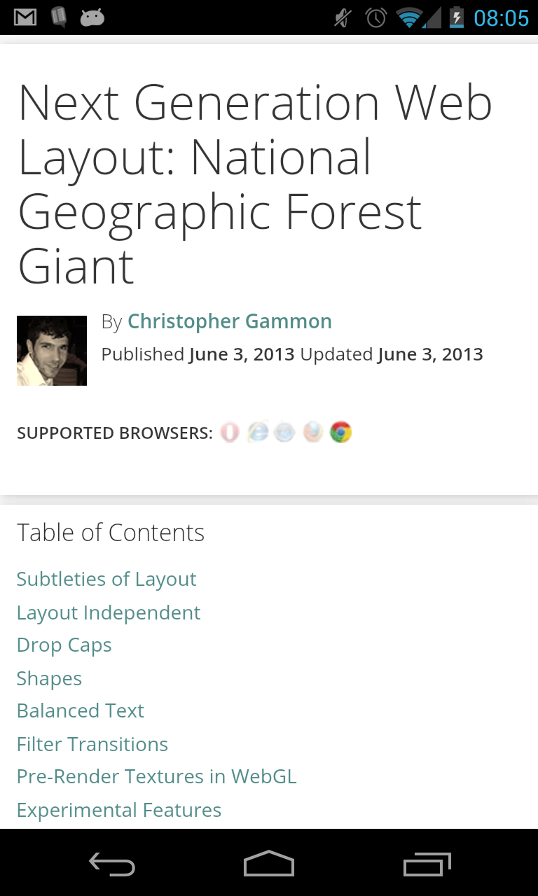
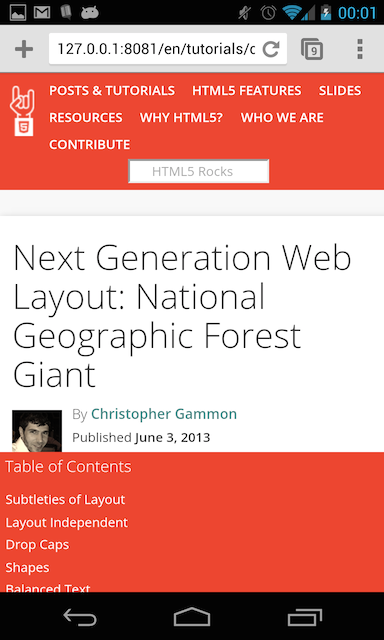
My current focus is on the mobile web. Everything I do need should be to help developers “get” mobile. With this in mind, I was skiming html5rocks on my nexus, and I was struck by the fact that I could not see any content on the first page. Not good.
There are a couple of things that we need to fix on HTML5Rocks when it comes to mobile. Today I am going to focus on the Table of Contents.
The Table of Contents (ToC), depending on the article can be 1/2 a screen in height to 3 screens in height. However you look at the it, you have to scroll to be able to start reading the content. The Table of Contents is also rooted at the top of the document, which on mobile means that I have to scroll all the way to the top to be able to navigate around or understand the structure. Argh.
Just have a look at one of the current articles. Yes the header is too large, but even this small ToC is blocking us from reading the content.

I am working off the idea that if we can get the user to the content quicker, we will improve our read-time, reduce our bounce-rate and create an all-round better experience for developers who read the content we produce.
There are some constraints though:
- ToC help you navigate around the page so they need to be visible to the user on page load
- Ideally they should always be visible, or easily accessible so you can quickly jump to the parts you need
- Due to constraints on the screen size, they should get out of the way as quickly as possible
- There should be no rendered-html differences between the mobile and “desktop” versions
- If possible use no JS.
With all these in mind I have created my first experiemental ToC. I call it the “Bottom ToC”.
The Bottom ToC is simply a Table of Contents anchored to the bottom of the viewport. When the reader wants to get access to the page structure they simple tap the “ToC” area, it expands into view (whilst keeping them at the same point in their document) letting them select their next reading point. To dismiss the ToC the user can simply clicks back in the main document.
Bottom ToC in its natural state:

Bottom Toc expanded:

It’s not perfect, but I thought it was interesting enough to document.
So, how is it built?
It was a pretty simple build in the end, it required no Javascript and no changes to the rendered HTML. It uses a combination of position: fixed and the :active pseudo class.
Our ToC is structured as a nested set of <ul> elements inside a <nav> element - pretty much how every menu is structured.
<nav class="outline toc">
  <h3>Table of Contents</h3>
  <ul>
    <li><a href="#toc-introduction">Introduction</a></li>
    <li><a href="#toc-topic-sounds">Creating the sounds</a></li>
    <li><a href="#toc-topic-sound">Engine sound</a>
      <ul>
          <li><a href="#toc-topic-looks-like">Looks like this</a></li>
          <li><a href="#toc-topic-go">Give it a go</a></li>
      </ul>
    </li>
   <li><a href="#toc-topic-sync">Getting the sync</a></li>
</nav>
The CSS is simple too. To make it anchor to the bottom of the screen and open when the user clicks on it we do as follows:
.outline.toc {
   position: fixed;
   bottom: 0;
   left: 0;
   right: 0;
   height: 1em;
   overflow: auto;
}

.outline.toc:active {
   height: 5em;
}
That’s it. The important bits are the position: fixed, which takes the element out of the natural flow of the document and anchors it to a defined area in the viewport - in our case the bottom of the viewport. We used the :active psuedo class to manage the opening and closing of the table of contents.
:active is interesting on mobile as it is normally used to style an element with a id that matches the string in the document fragment of the URL (the bit after the #). This is often the case if you click on an anchor that points to an area inside the same document. On mobile browsers such as Safari and Chrome the :active class is also set when you press on any element, which leads to this effect. The really nice thing is that when you click back in the main article, the active element changes thus hiding the menu again.
There are still a couple of isses to resolve so it is not the perfect solution. For example, when the user scrolls up or down in the ToC and reaches one of the extremities the scroll event gets passed through to the parent document.
All in all, I think this is a neat little solution.
